How to Make A Pretty Map
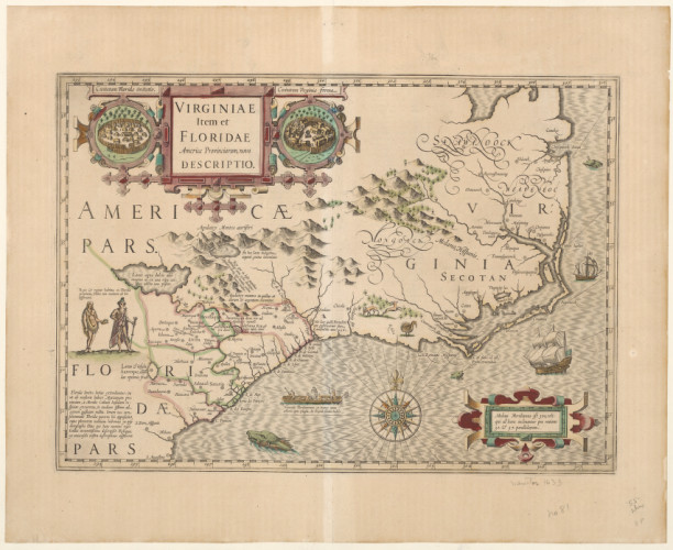

map from 1636 documenting tribal territories, courtesy of the NC Map Collection in the UNC library
Modern geographers are trained in geographic information systems, highly reliant on software and abundant data to make the required maps. GIS careers are in high demand from both sides – employer and employee – following the adage that a picture speaks 1000 words. Maps talk. But with this technological shift, much of the art is gone from cartography – but it doesn’t have to be.
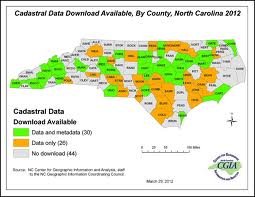
Here’s a fairly basic map describing data availability for the modern North Carolina geospatial database. Take a minute to take it in and notice all of the extra parts, not just the borders of the state’s counties.

www.ncgicc.com
This is one of the most basic GIS maps I could find of the region, but it proudly displays most of the basic components: scale, author, compass rose, legend, credit for the data, title, date made, and border (or “neatline). The colors are in stark contrast and, when converted into black and white (like if I printed it), still distinguishable.
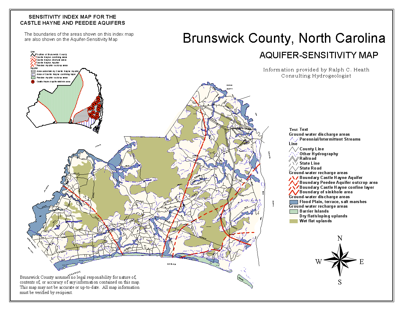
For comparison, a not-so-great example. See if you can spot the missing components. Once you’ve thought about enough of these examples, I guarantee you that missing map components will become a pet peeve of yours too:

www.brunsco.net
I’ve been to Brunswick County before and I have a hard time telling what’s going on here. For one, what’s the scale? Where in NC or the East Coast are we talking about? By the warning that this map may not be up-t0-date, one can assume that some of the data involved is shifting over time – but when is this a snapshot of? Taking a step back, is this an image I could consider framing and hanging on the office wall? That question should be the litmus test for publication or presentation. If the answer is no, you’ve got work to do. And it may not be a lot of work. Here’s a few basic tips to turn your map from computer screen gobbledygook to frameworthy art:
- Give some context. Not everyone is going to know your corner of the universe. And while a few lucky world residents really do live on islands, not as many as maps would lead you to believe. If there’s land attached to your area of study, show it in a demure faded color. For uncommon borders, give an inset with a little box around the region on a larger-scale map.
- Be nice to those with black-and-white printers. Remember when you were back in college and your budget dictated ramen noodles for dinner? Students like these, especially if you are an academic, are at least some component of your readership. So are cash-strapped state agency employees. Make it easy for them to print your document and understand it. Try putting the image in grayscale before you call it complete – and make sure all the categories of data are still visible. If not, try changing the color palette or using patterns instead of shades of gray.
- Scale bars! This is probably the most oft-forgotten component of the map. You may have biked from one end of the study area to the other, but others have not. It’s helpful to get a sense of distance without having to open Google Maps.
- Neatlines. That’s the border around your graphic. It gives the map a polished feeling and sets the frame for setting the image in an article. A clever border can also attract the attention of all those readers that skip the data tables and figures. But just like great art, don’t go overboard – it’s decoration, not the main attraction.
- Dates and metadata. Always credit where the contributing data came from and when the map was formulated. We often forget that maps are just a snapshot in time of the region. It’s like taking a high-speed photo of an Olympic runner in action – it’s the main action, but we also want to know what happens when he crosses the finish line.
- You may need 2 or more maps. As fun as it is to pile all the data available on top of one another, it can get confusing really fast. Each map should have a single take-home message. If a particular piece of data isn’t relevant to the main point, put it elsewhere. We all like to think that we can recreate the world on a piece of paper, but each map is a representation of a particularly thin slice of society. Make sure that slice is not unweildy.
No comments:
Post a Comment